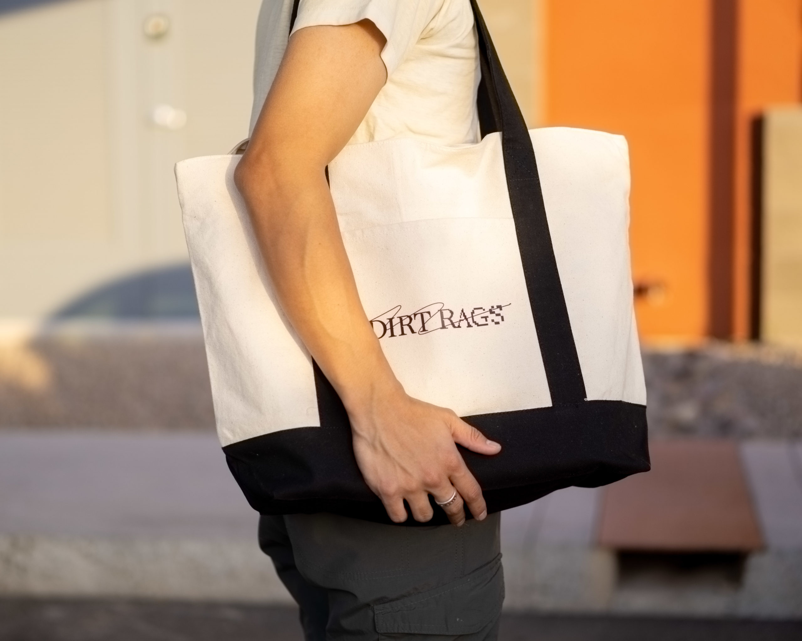
Dirt Rags
Style Your Own Chapter
Project
Freelance
Client
Dirt Rags
Industry
Fashion
Scope
Art Direction
Brand Identity
Website Design
Challenge
Dirt Rags is a vintage clothing retailer that sells a curation of timeworn garments.
Building steam selling his clothing over Instagram and vending markets, Justin (owner), asked if I could help him build a complete brand identity for his business. Excitedly I said yes, and we immediately got to work ideating how to bring his style to life across digital and physical touchpoints.
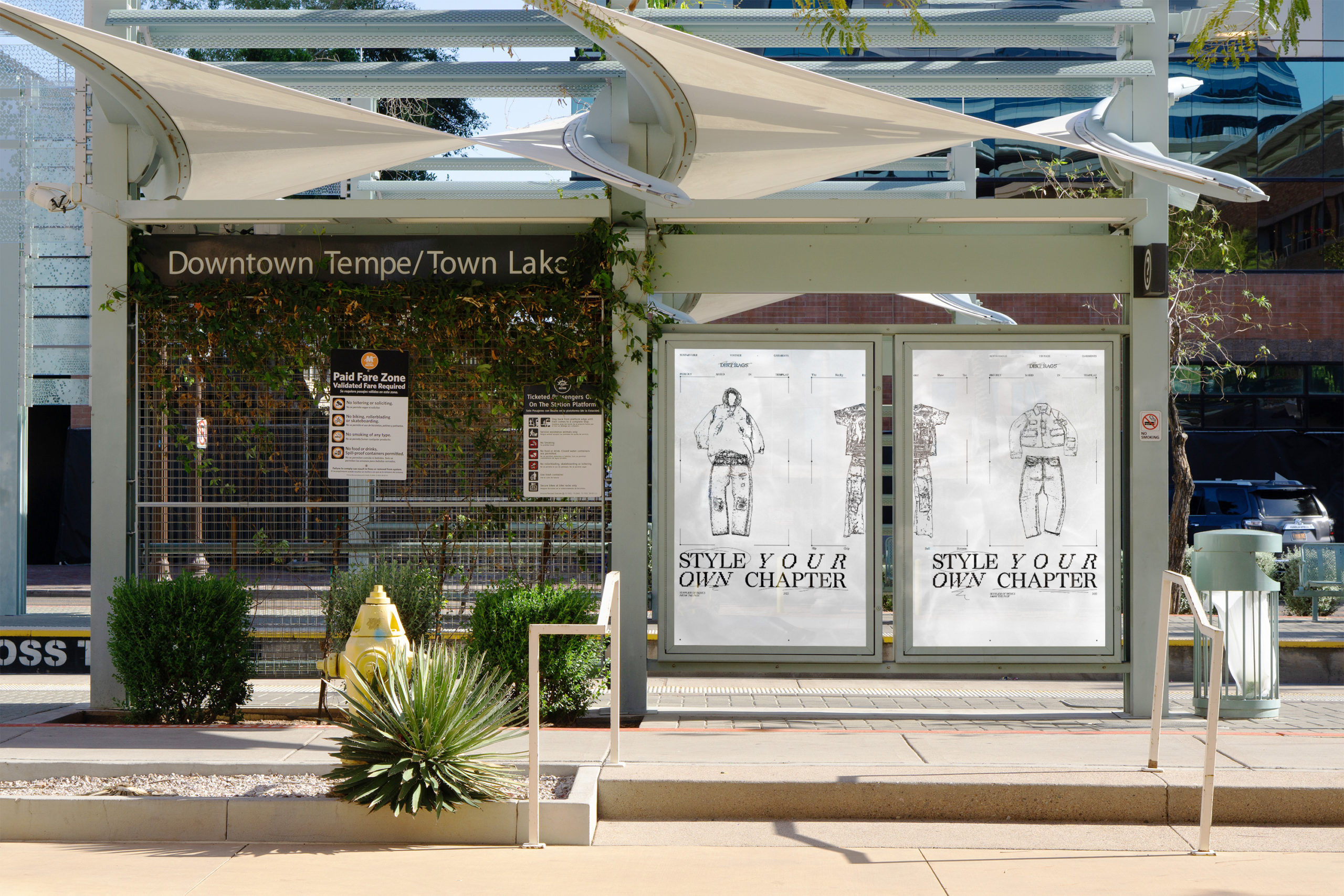
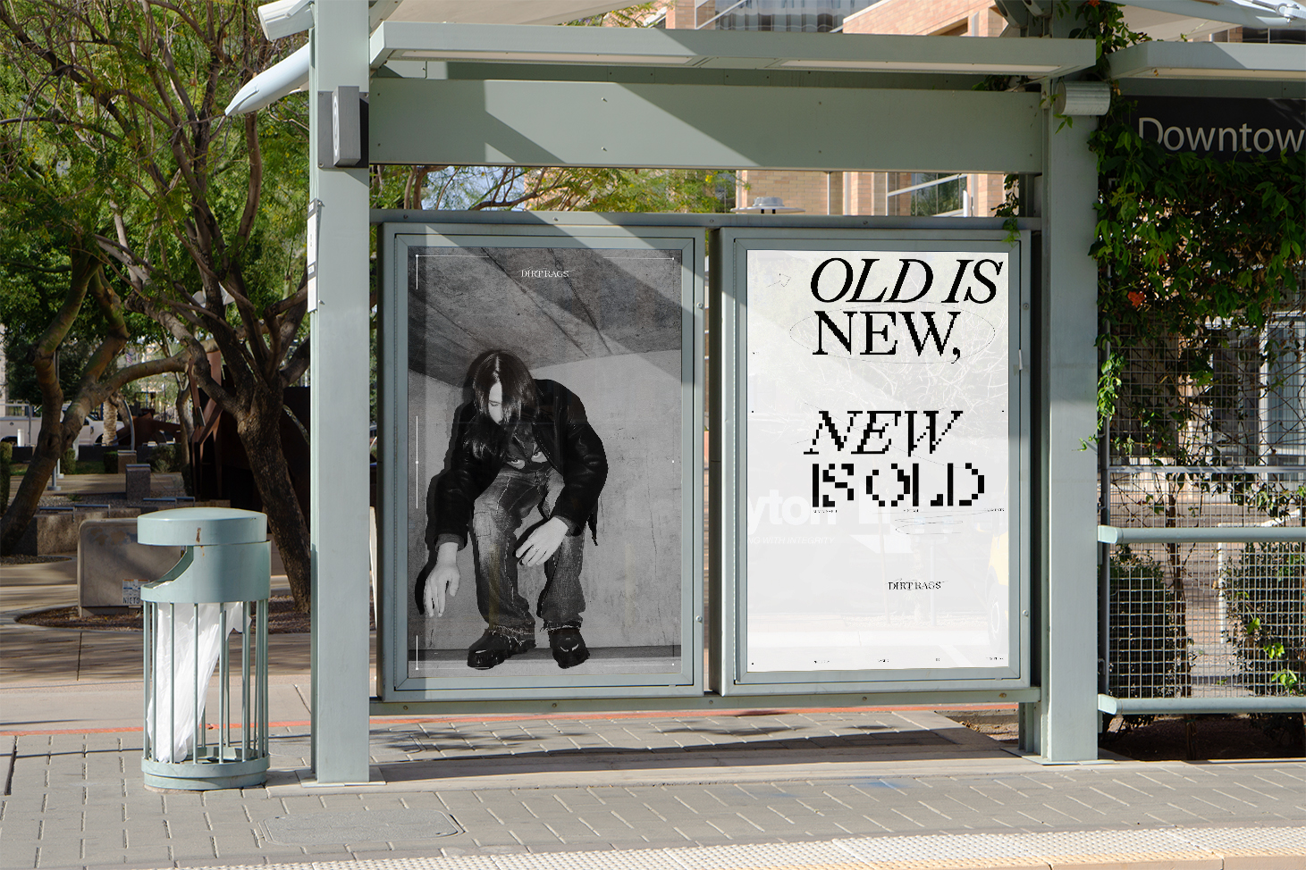
Approach
Speaking with Justin gave me a newfound appreciation for vintage clothing. He expressed how each garment has been worn through the decades gathering patina from everyday use, differing lifestyles, and contouring from person to person. All are uniquely distressed in a way that is impossible to replicate.
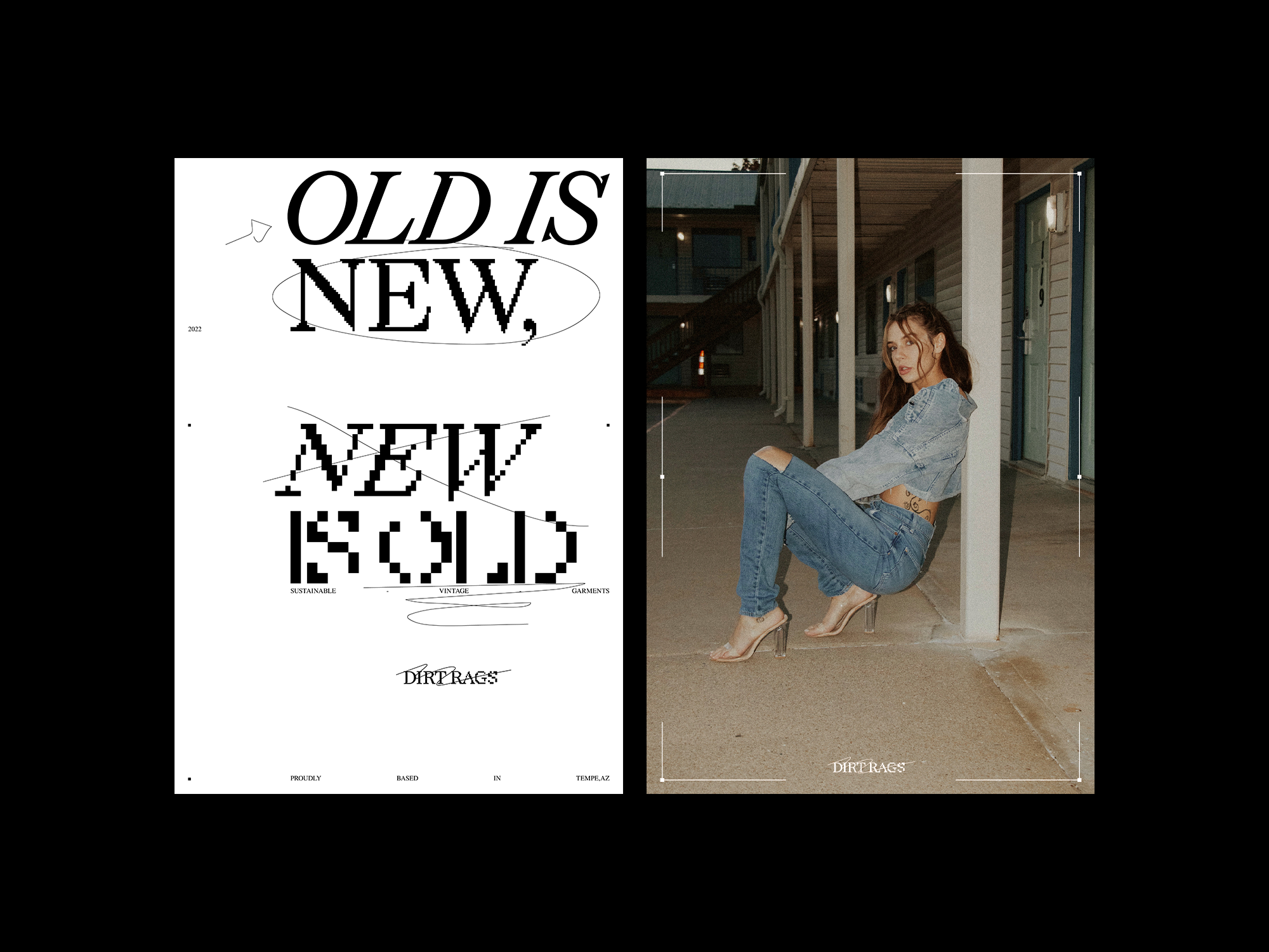
My solution was to create a brand identity that celebrates the worn nature of his clothing collections. Utilizing pixelated typography as the foundation, I developed a look that celebrates each chapter of distressing and patina.
In the end, I designed the entirety of his identity including logo lockups, bitmaps, hang tags, an interactive website, handmade textures, art direction, business cards, and motion to wrap it all up.
Drafting
First and foremost Dirt Rags is a vintage retailer. The logo needed to come across as a fashion brand and work on small scales for things like clothing tags. This narrowed my drafting phase to a wordmark over something more abstract.
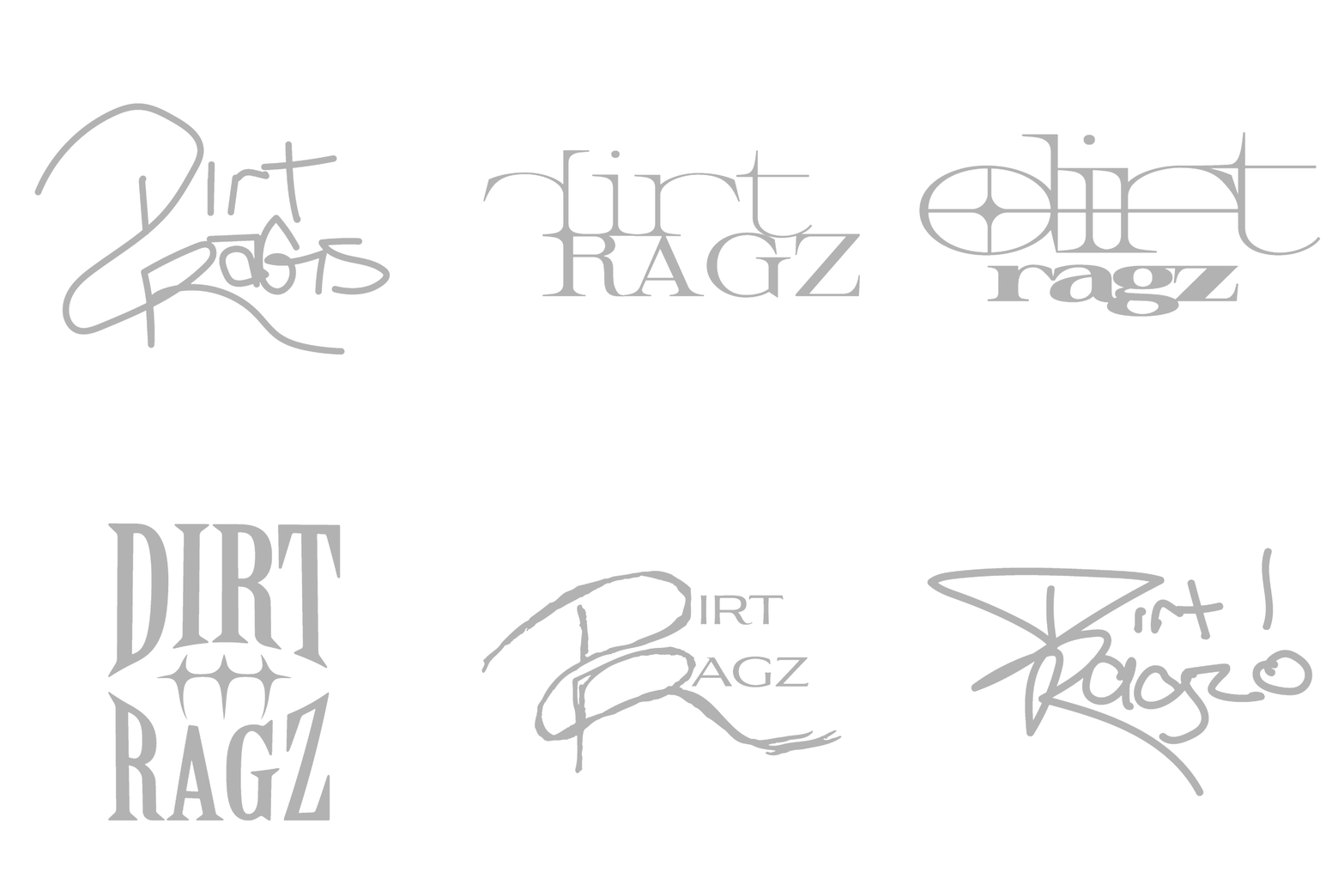
Logo Concept
The main concept is to visualize the spectrum of use and abuse garments gather over time. The logo begins fresh, free from distortion, as the letters continue the wordmark gradually becomes more pixelated.
A single thread is used to capture individual damages and break up the structure with natural form.
Bit Mapping
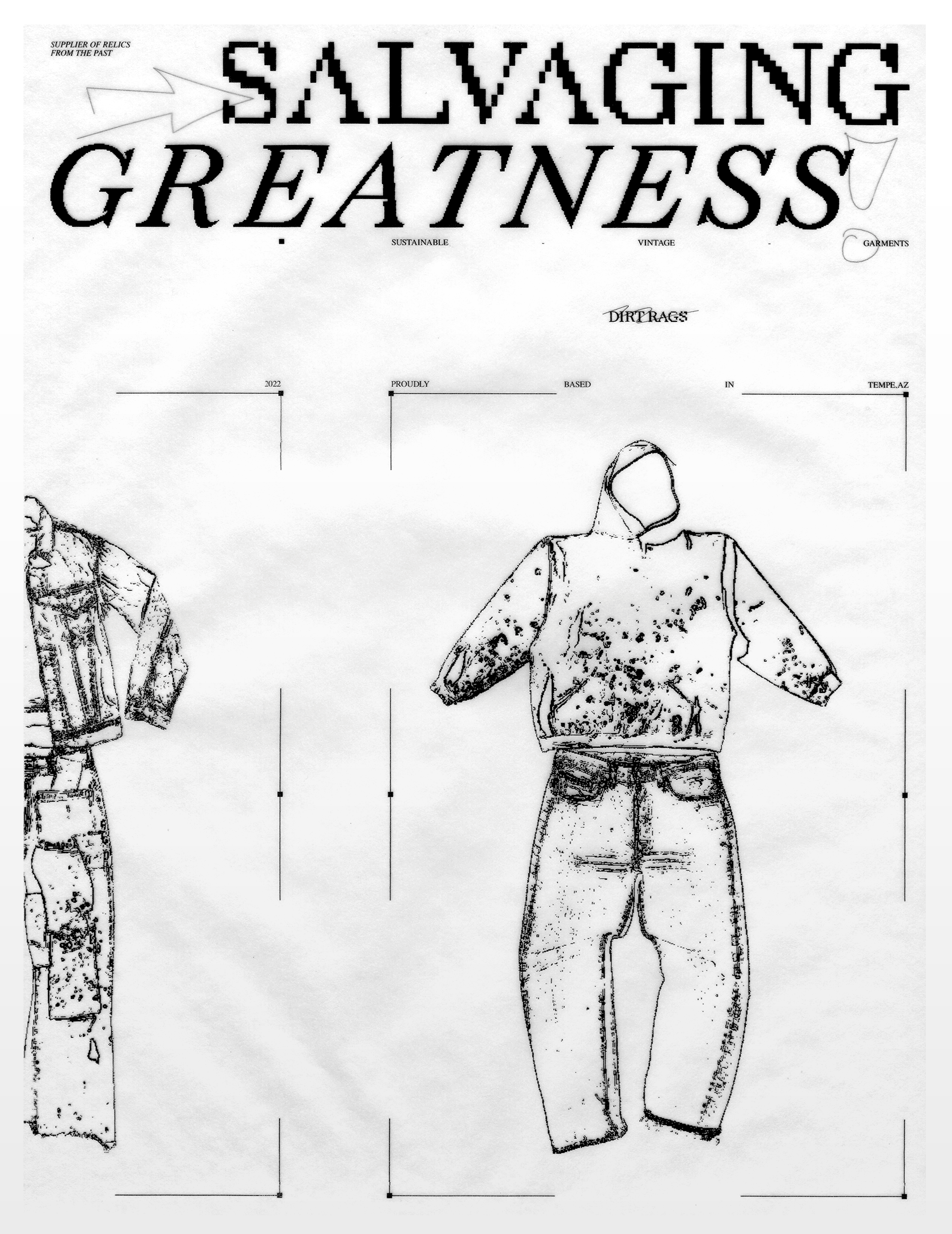
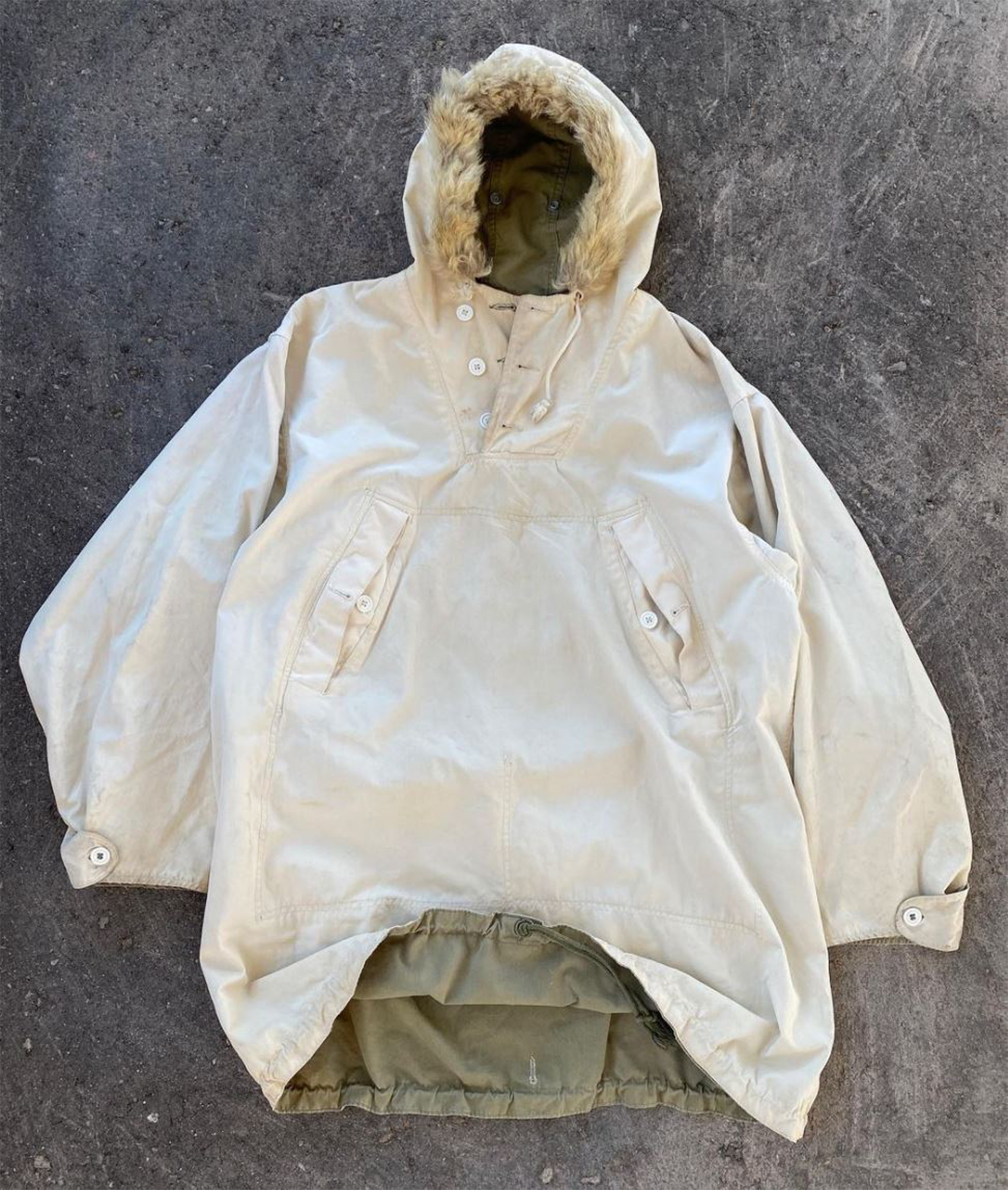
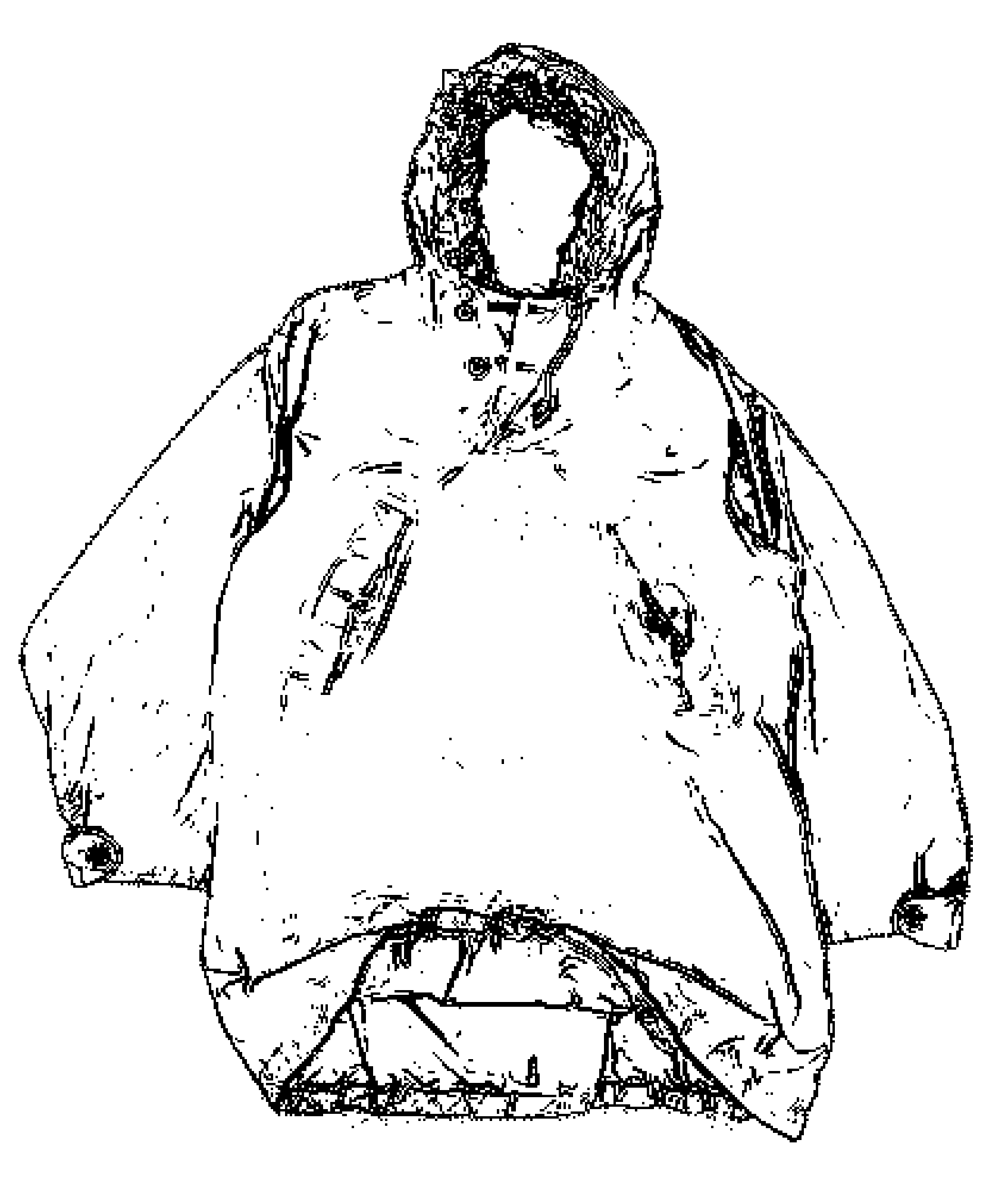
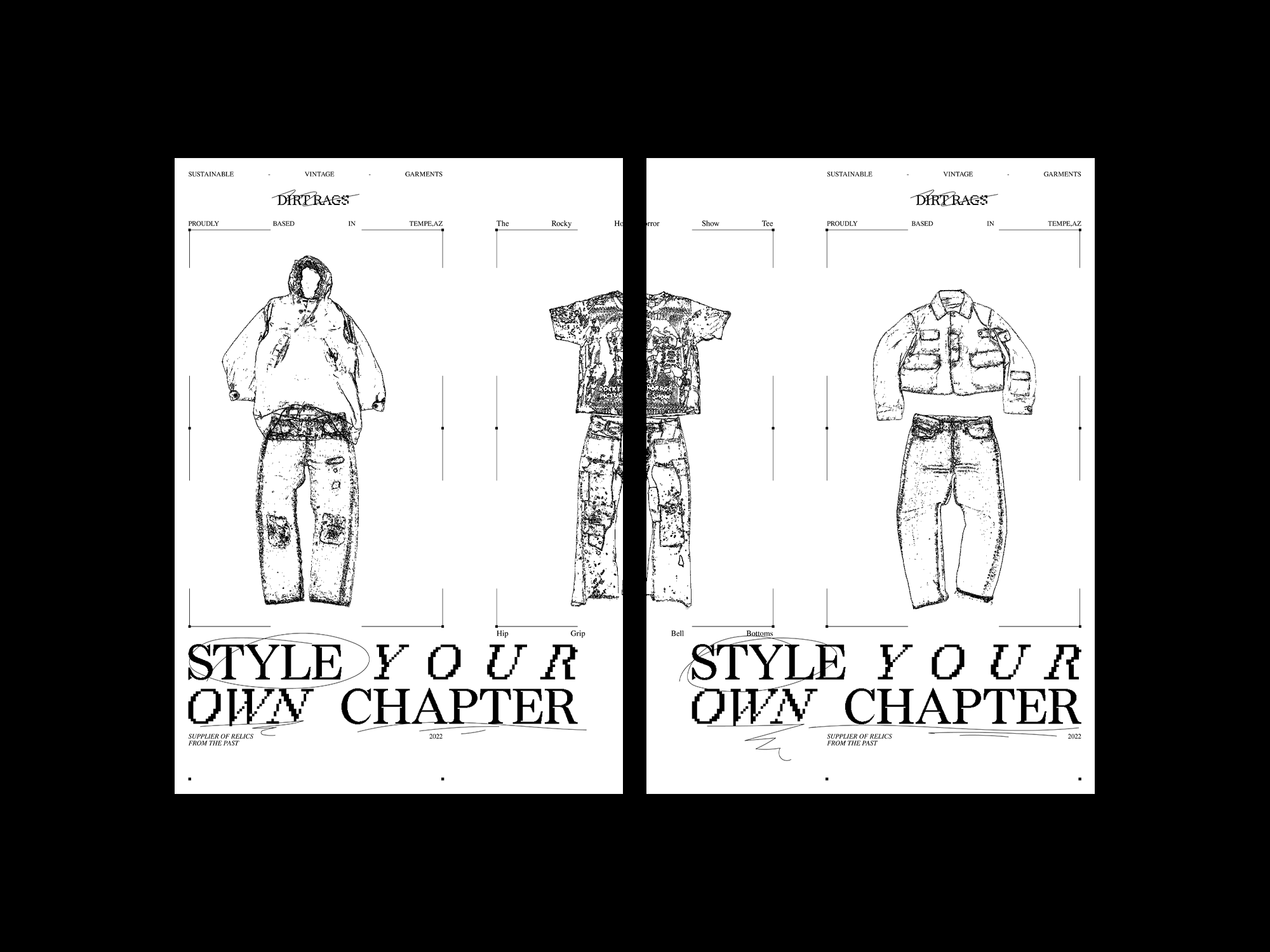
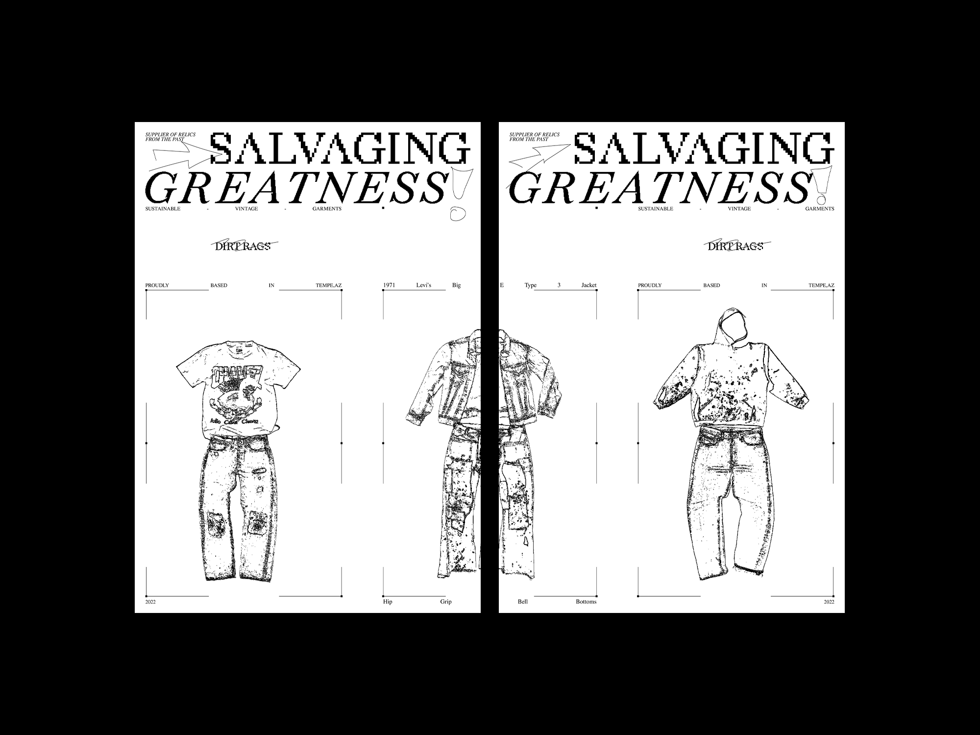
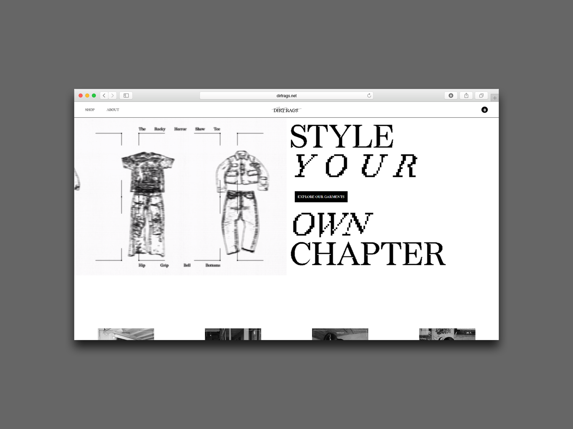
Showcasing garments with a bitmap creates a consistent silhouette to match the typographic style. New pick-ups can easily be generated into bitmaps for future campaigns as needed.
← Slide Me
Made for Mobile
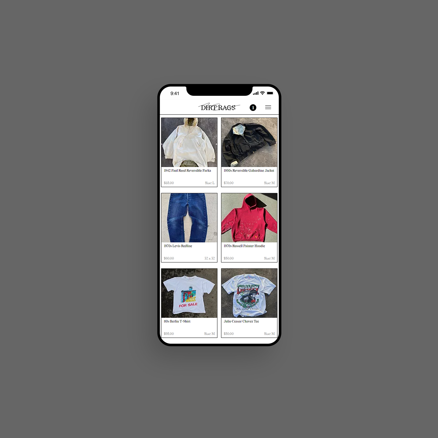
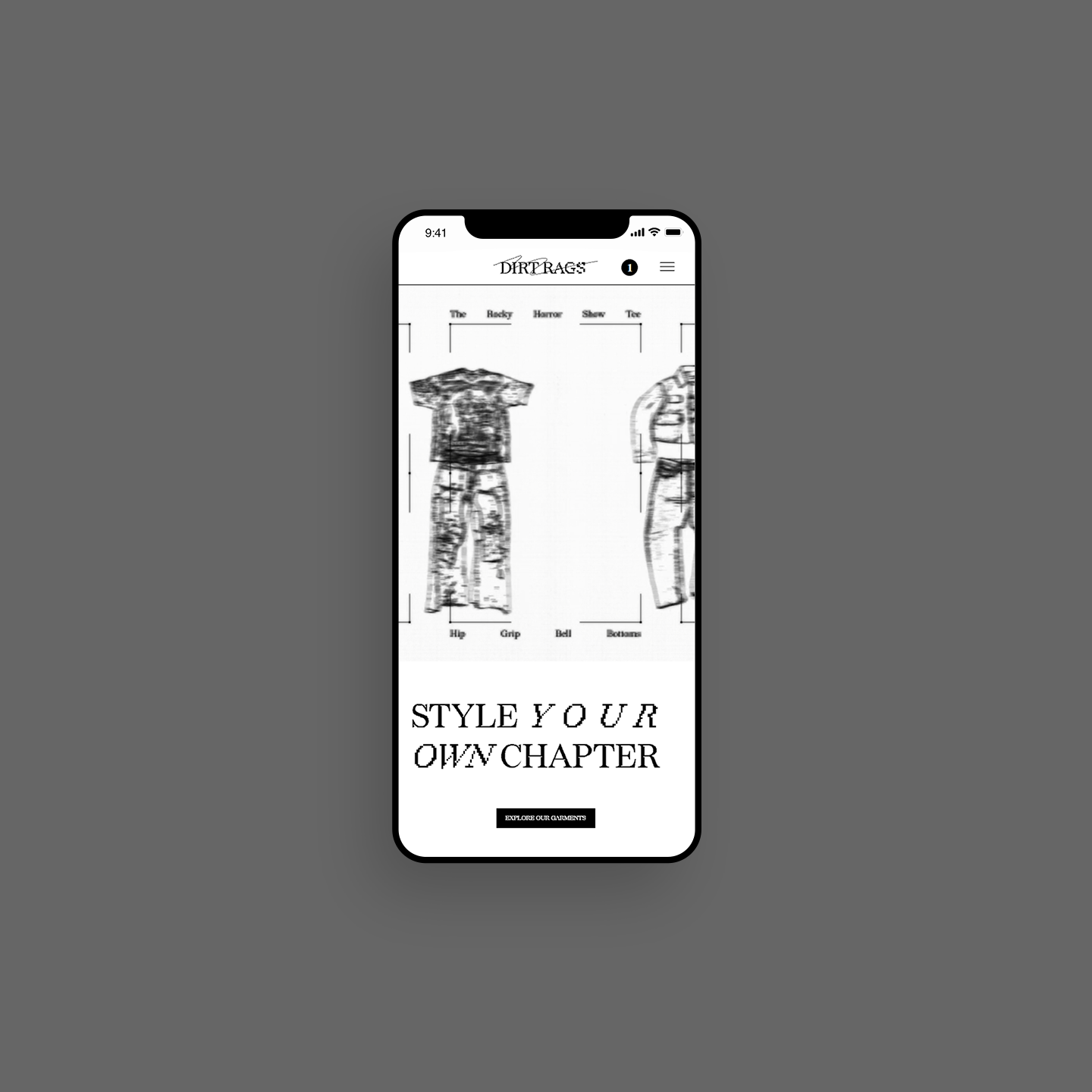
Keeping in mind a younger demographic, I made sure to optimize website design for mobile use. Using Editor X I created responsive repeaters that can be easily updated for new garments.
Analog Assets
Eco-friendly vellum brings print assets to life. Also, it just looks damn cool.
