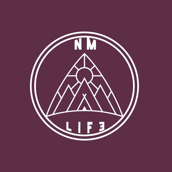
NM LIFE
Differentiation Among A Crowded Landscape
Project
Freelance
Client
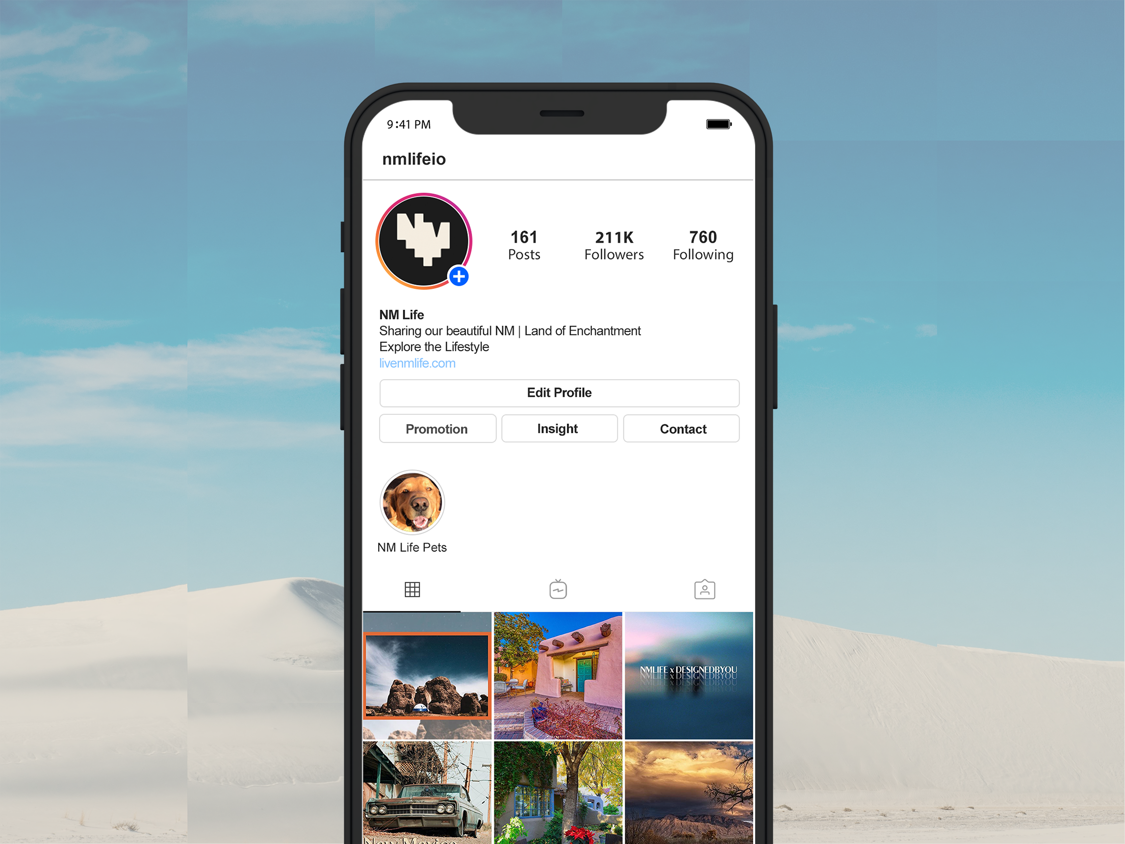
NM LIFE
Industry
Arts & Culture
Scope
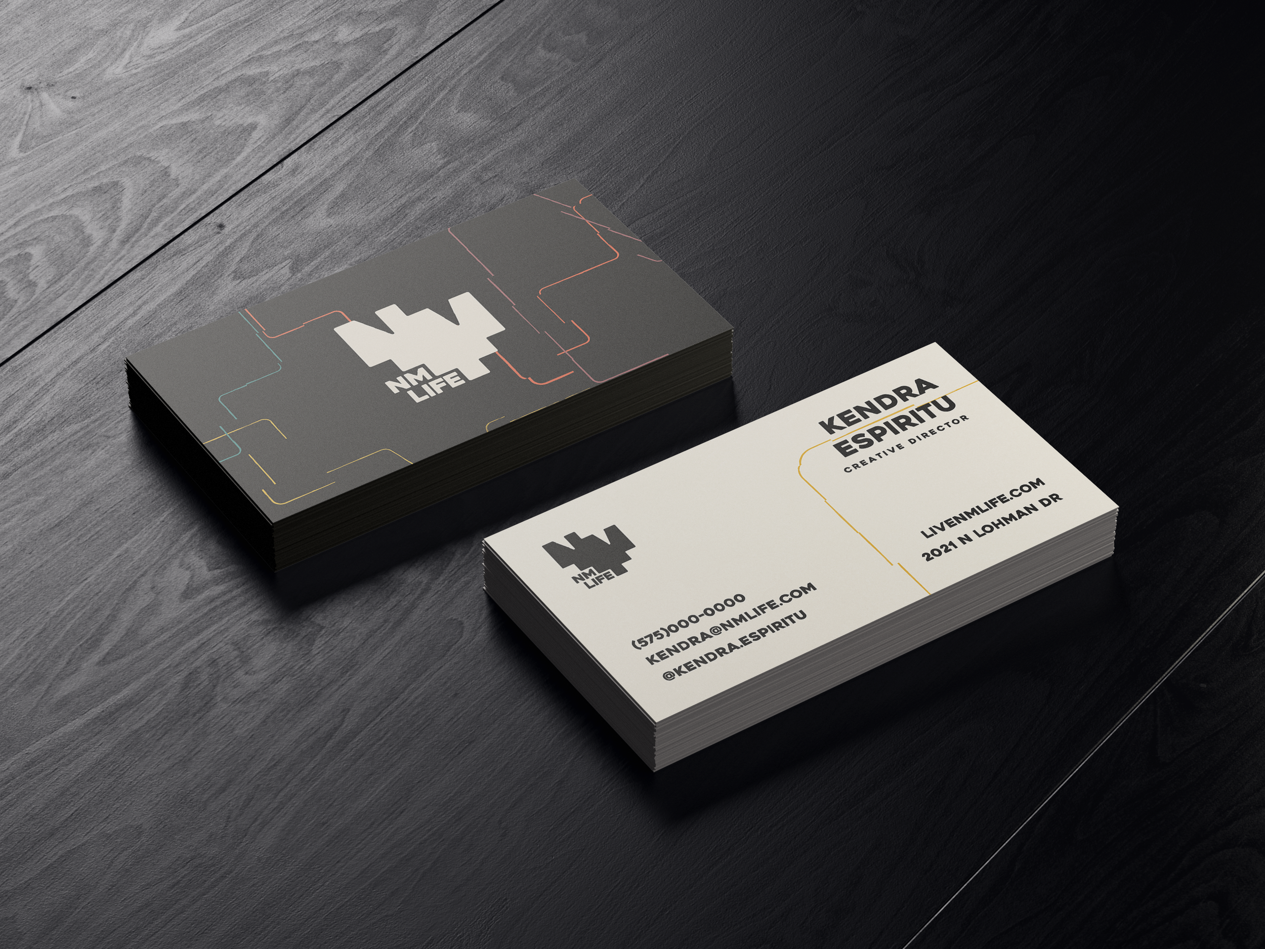
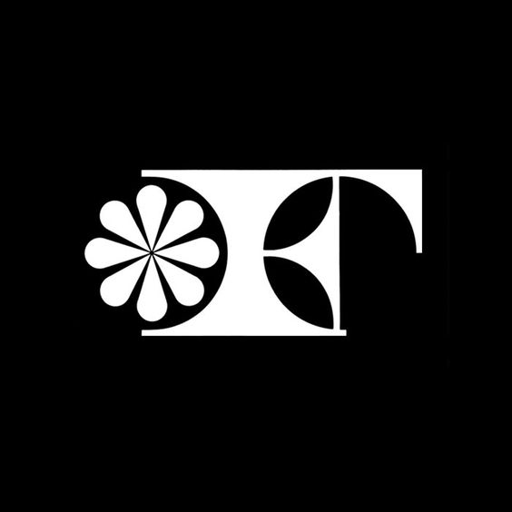
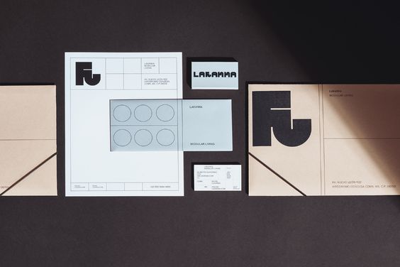
Brand Identity
Logo Design
Challenge
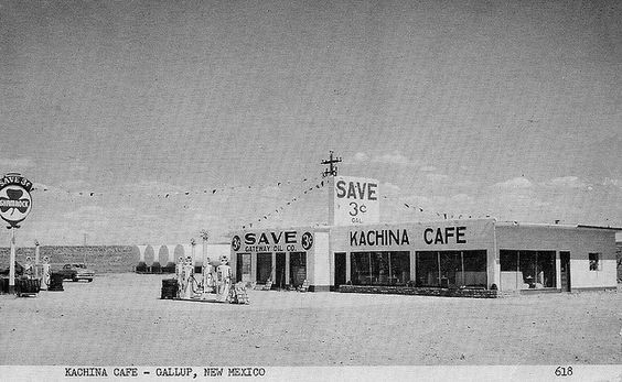
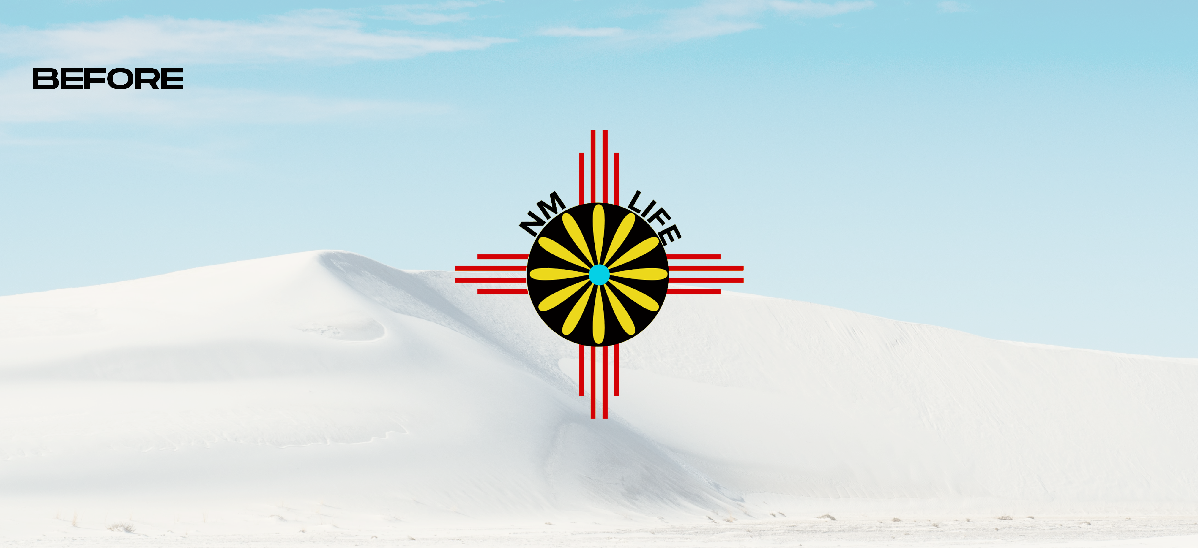
NM Life is an online community based around New Mexican culture. Spanning across major social networks, NM Life brings a taste of its unique views and lifestyle surrounding The Land of Enchantment.
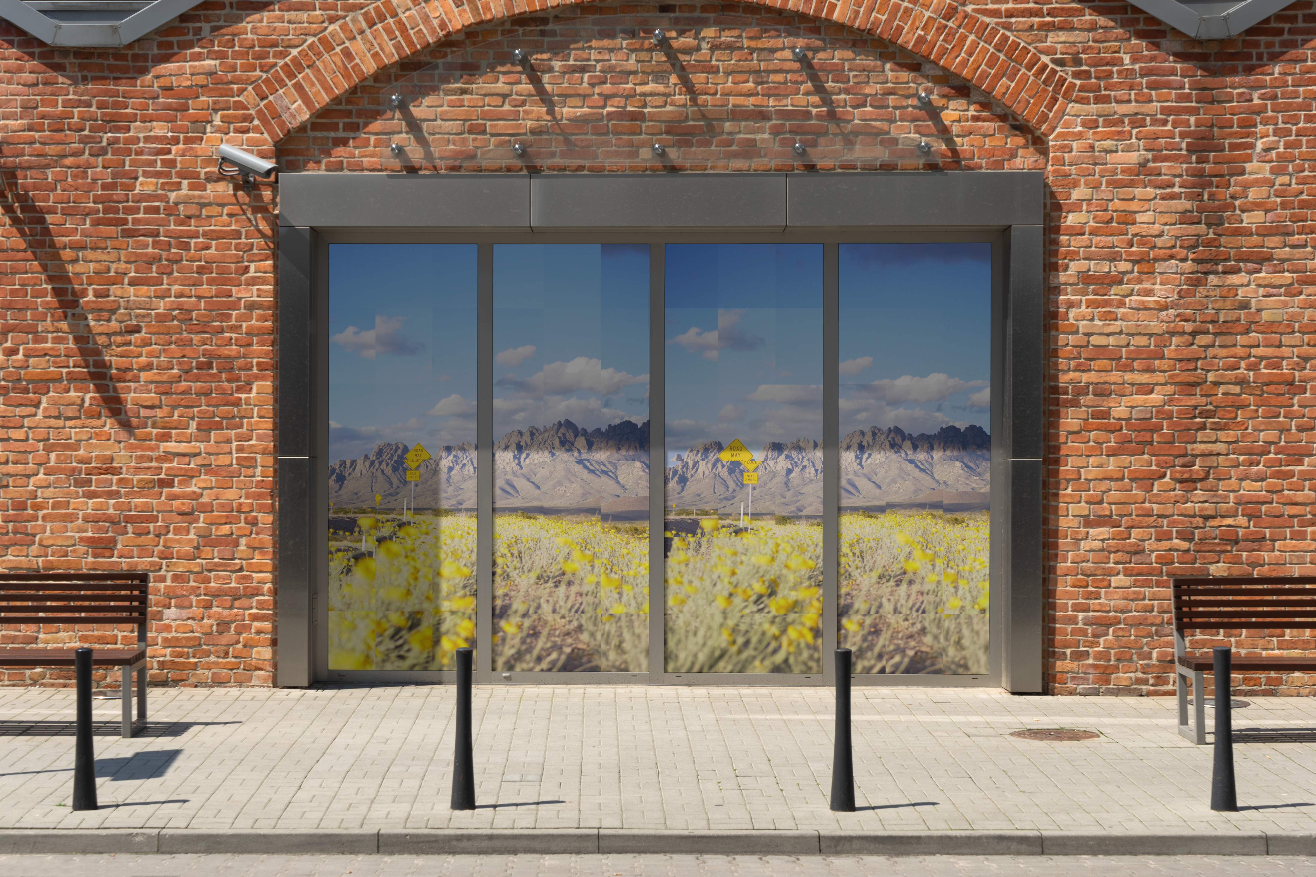
After a recent acquisition, it was due for a visual refresh.
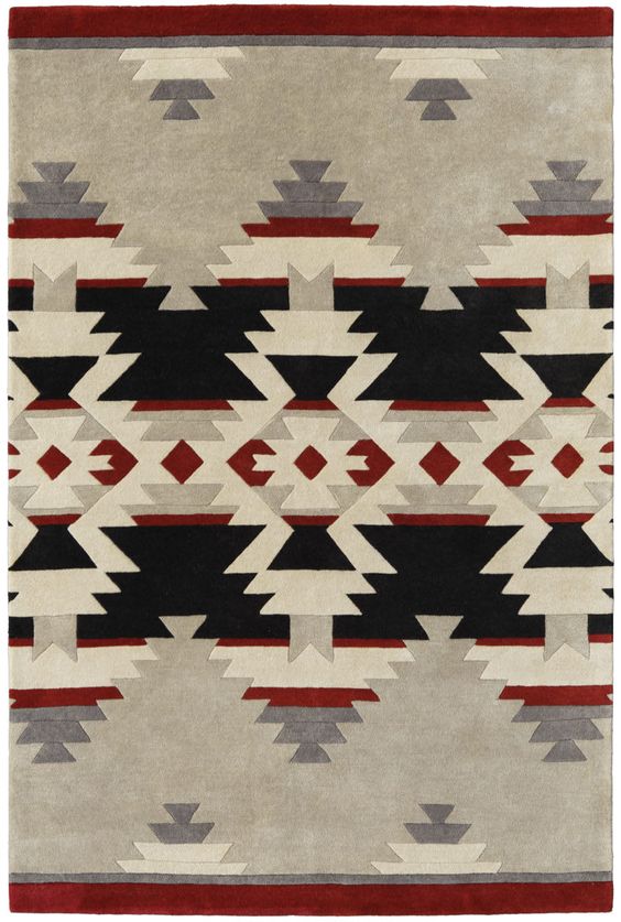
An early objective off the bat was to stay away from New Mexico's most cliche design, the Zia symbol. With new goals in the forefront such as an updated merch line and a physical storefront, NM Life needed to stand out amongst a lookalike landscape.
Approach
After speaking with co-owners and Rio about their vision for NM Life I gathered some key insights into what they were looking for.
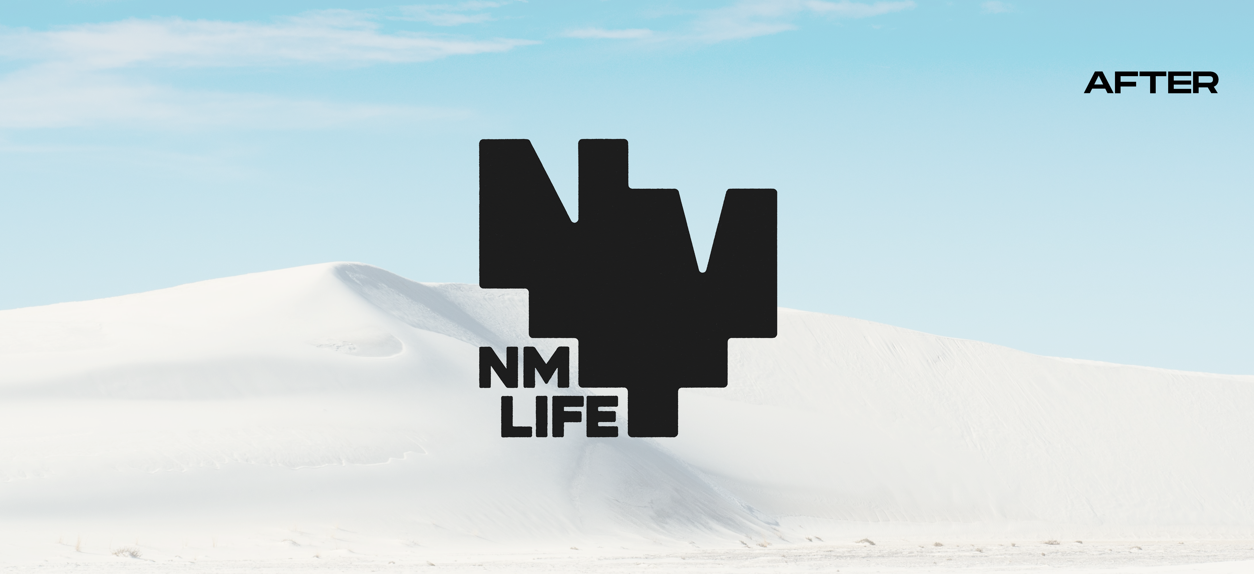
1. The mark needed to be memorable and have a New Mexican footprint.
2. Egar to expand their audience to a younger demographic, the design should feel fresh.
3. Due to their active presence on social media, the mark needed to be highly visible at small sizes.
Keeping this information in mind, I got to work putting together a few stylescapes that would serve as a visual compass.
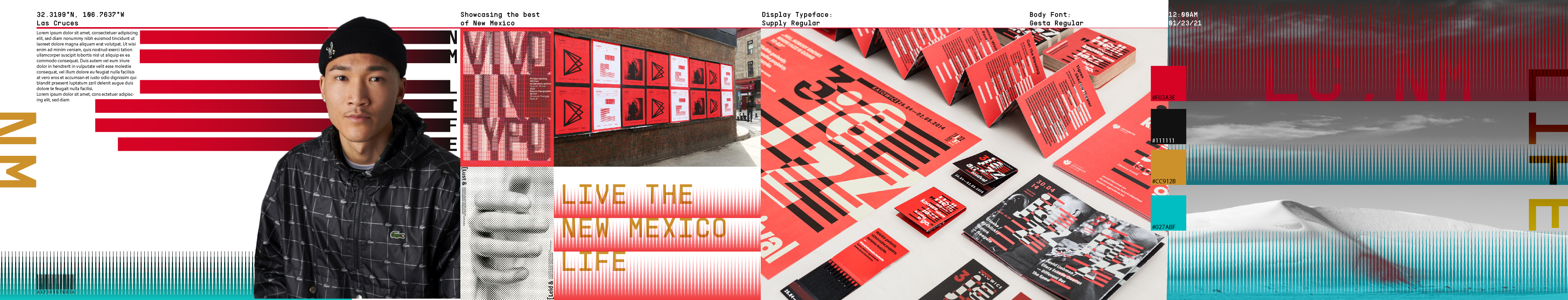
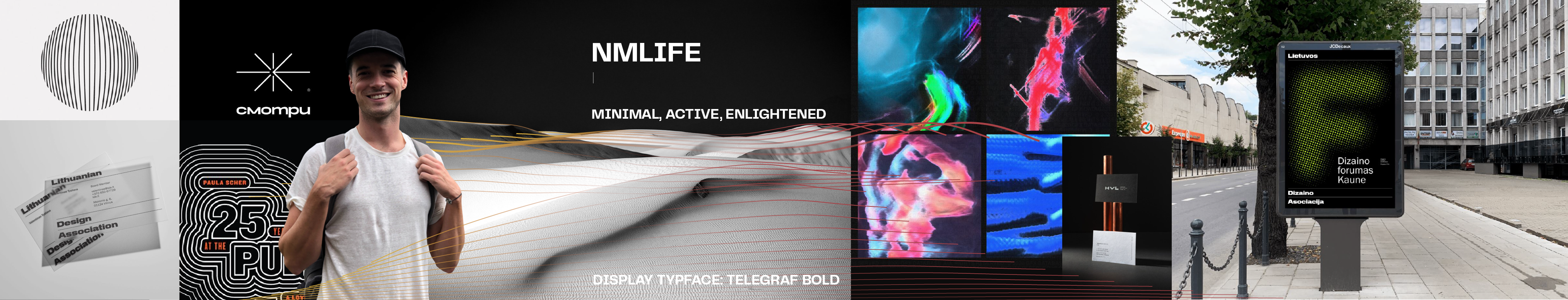
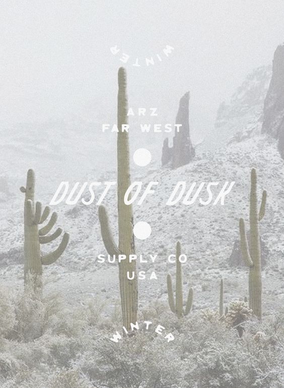
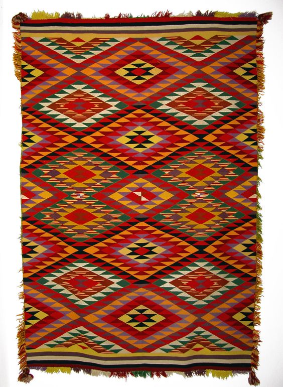
Stylescapes
Chosen Stylescape
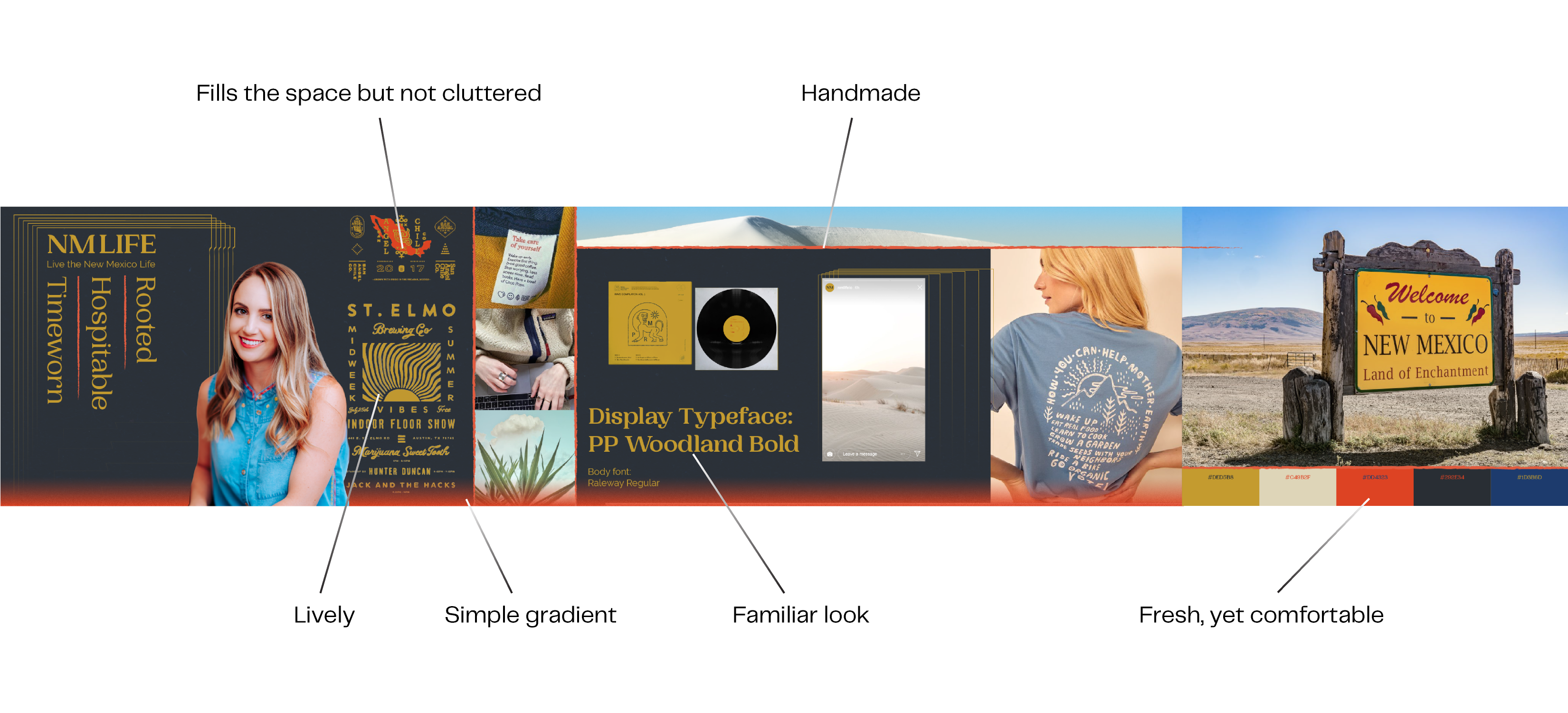
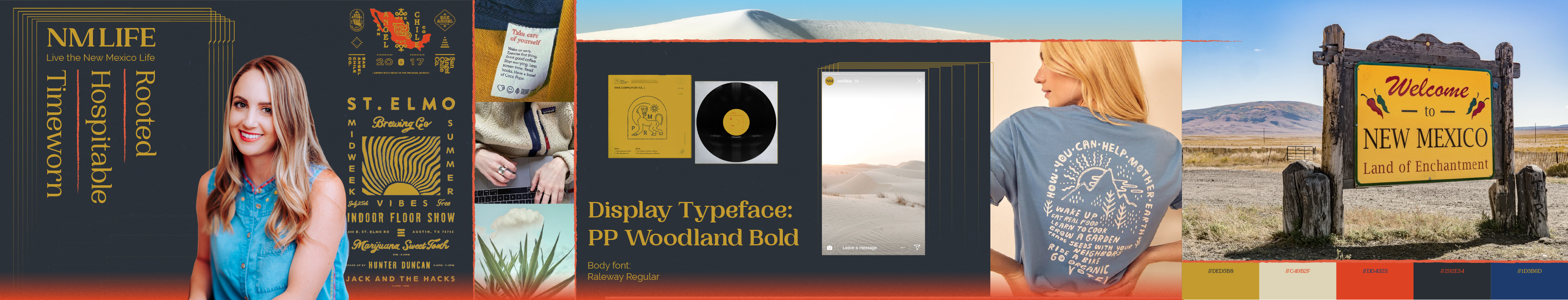
Logo Development
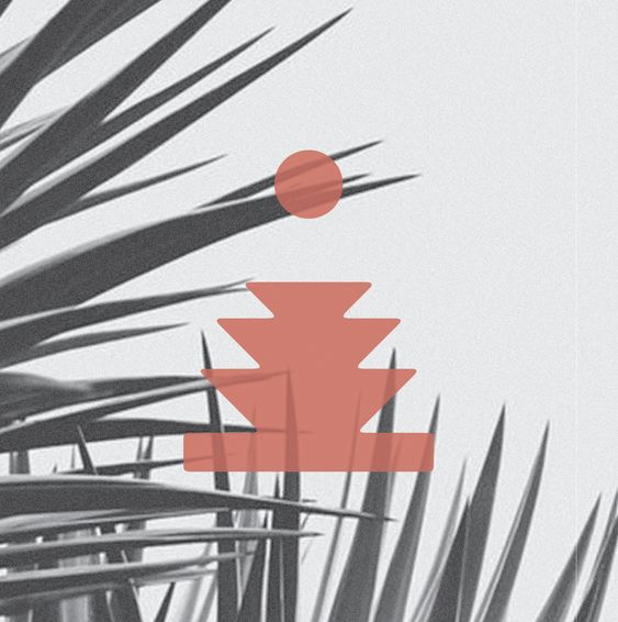
Photos were used in conjunction with the chosen stylescape as further inspiration and reference material.
A 6x6 grid was used to create a space for the logo and typography to live in.
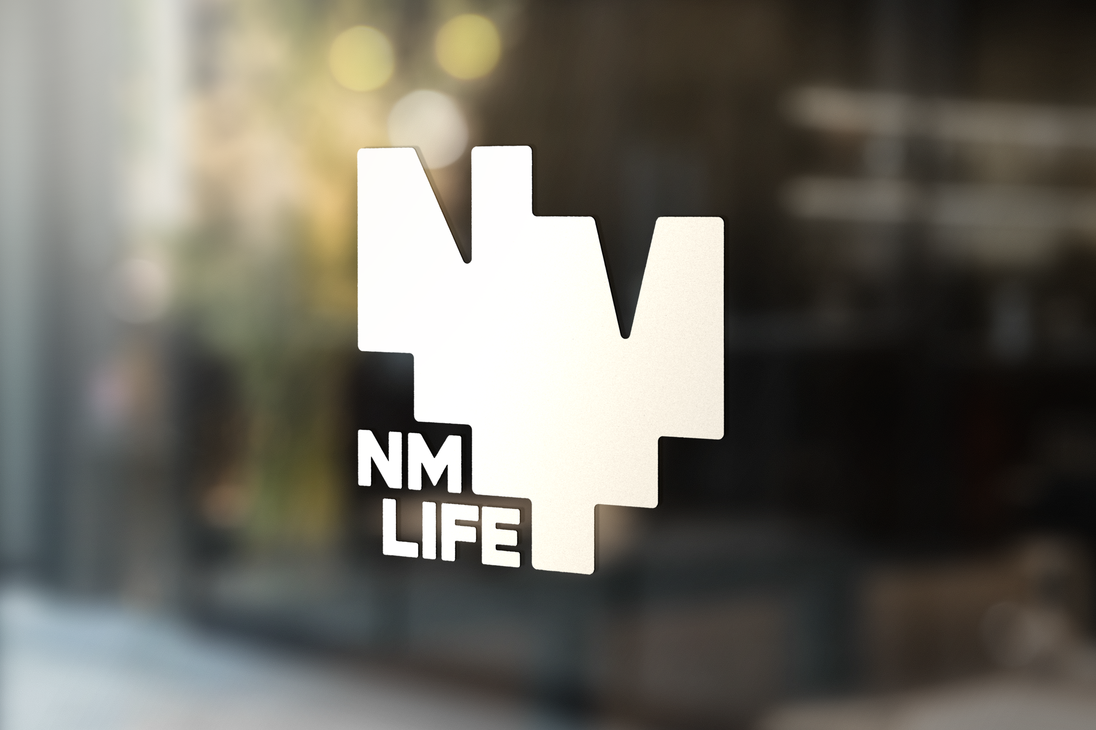
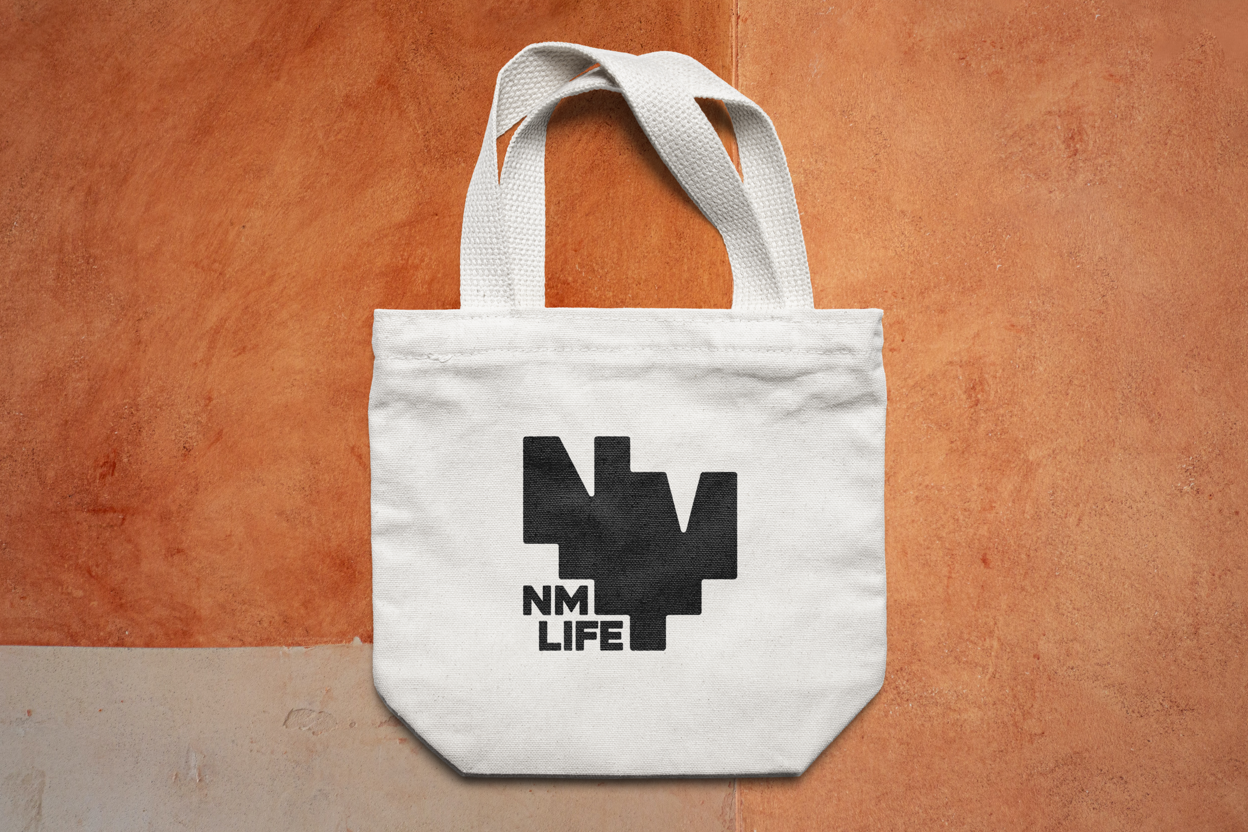
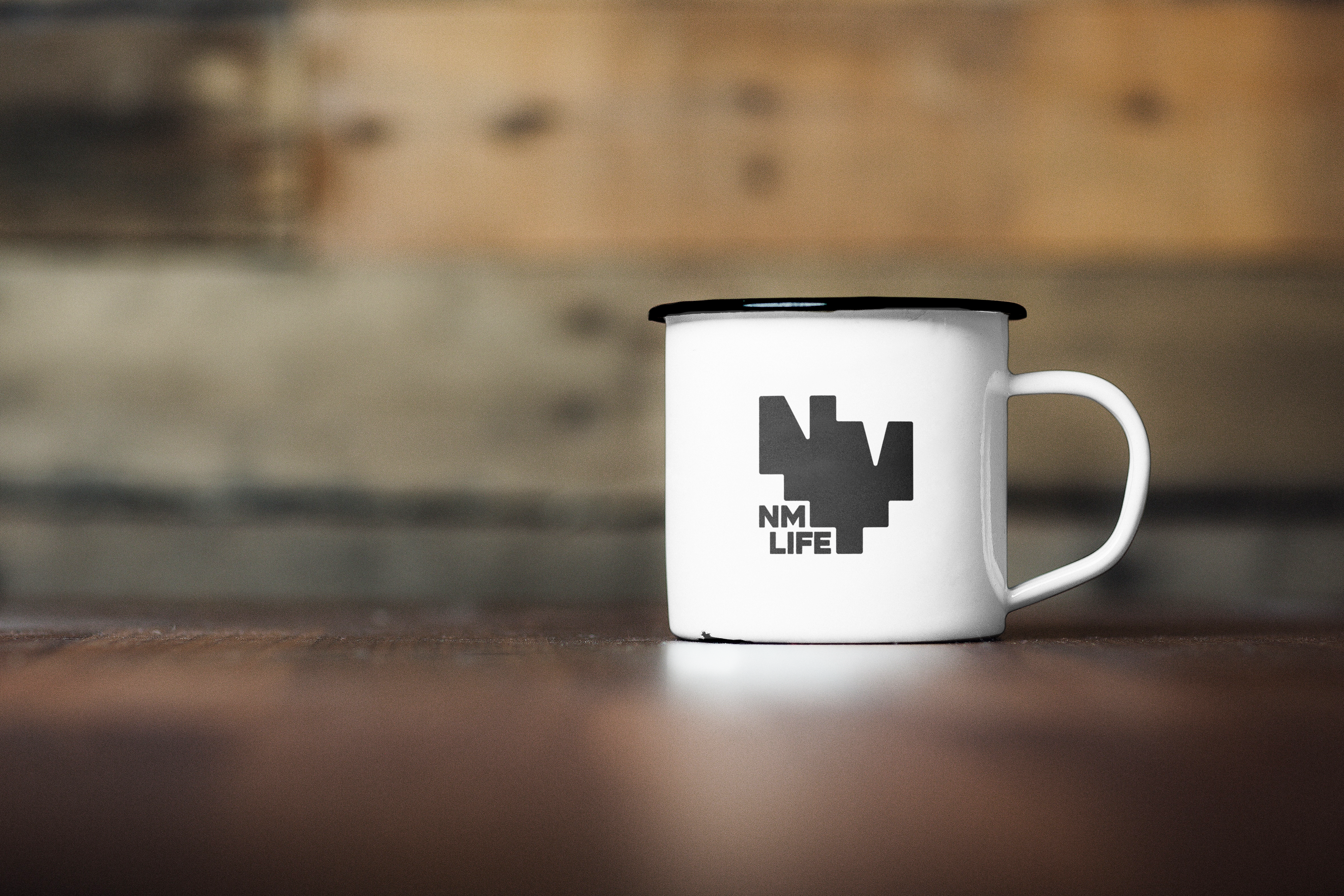
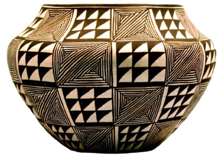
The logo was created with simple geometric shapes to give resemblance to traditional patterns seen around New Mexico.
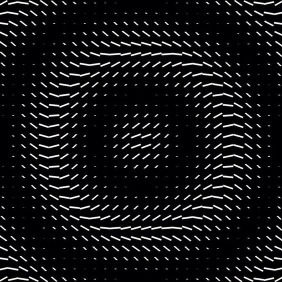
Applying Movement
Typography
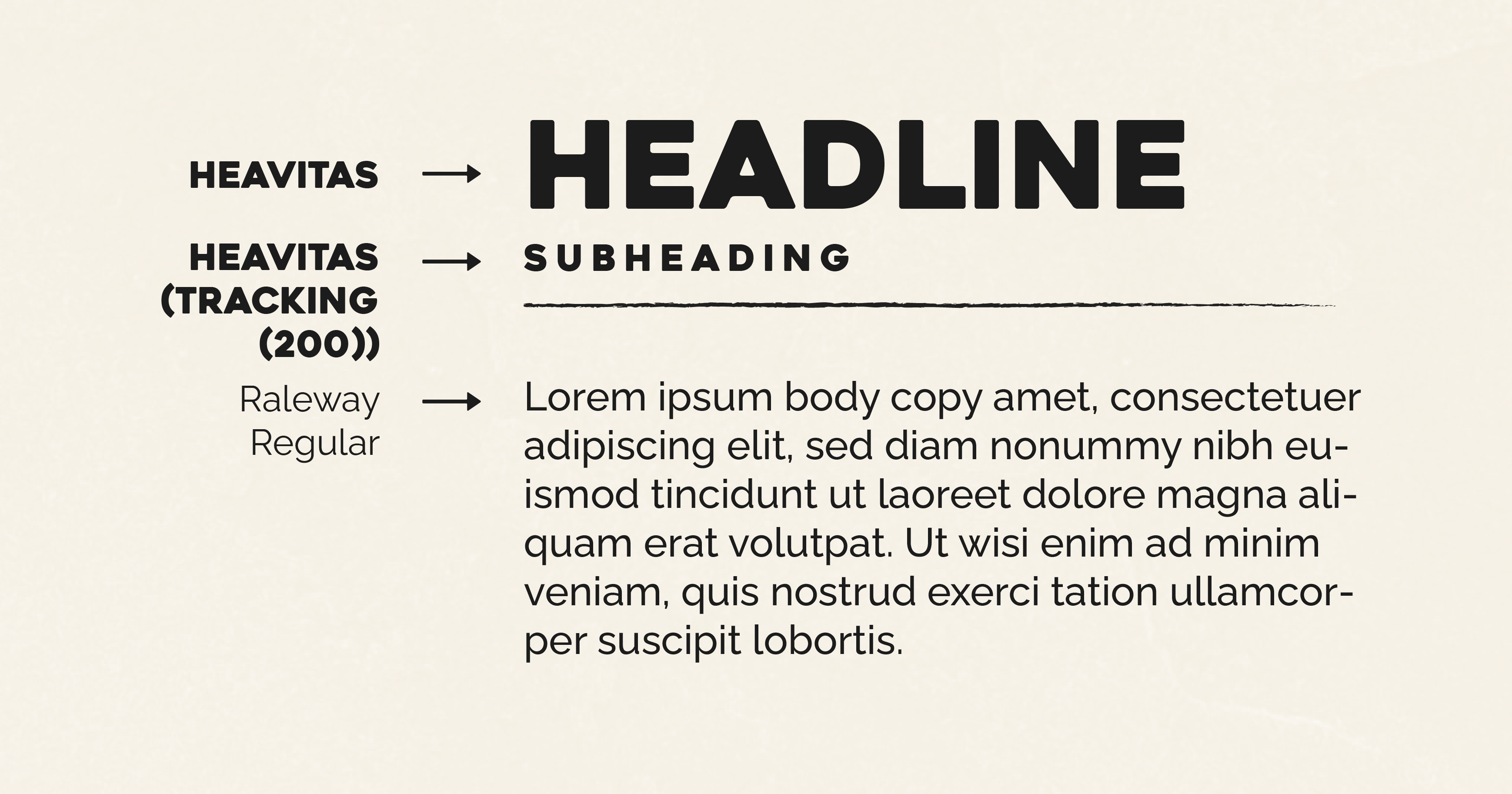
Heavitas was chosen as the display typeface for its bold footprint and rounded edges. Its characteristics closely resemble the primary logo.
Raleway is a clean typeface that complements the display type with thin, elegant features.
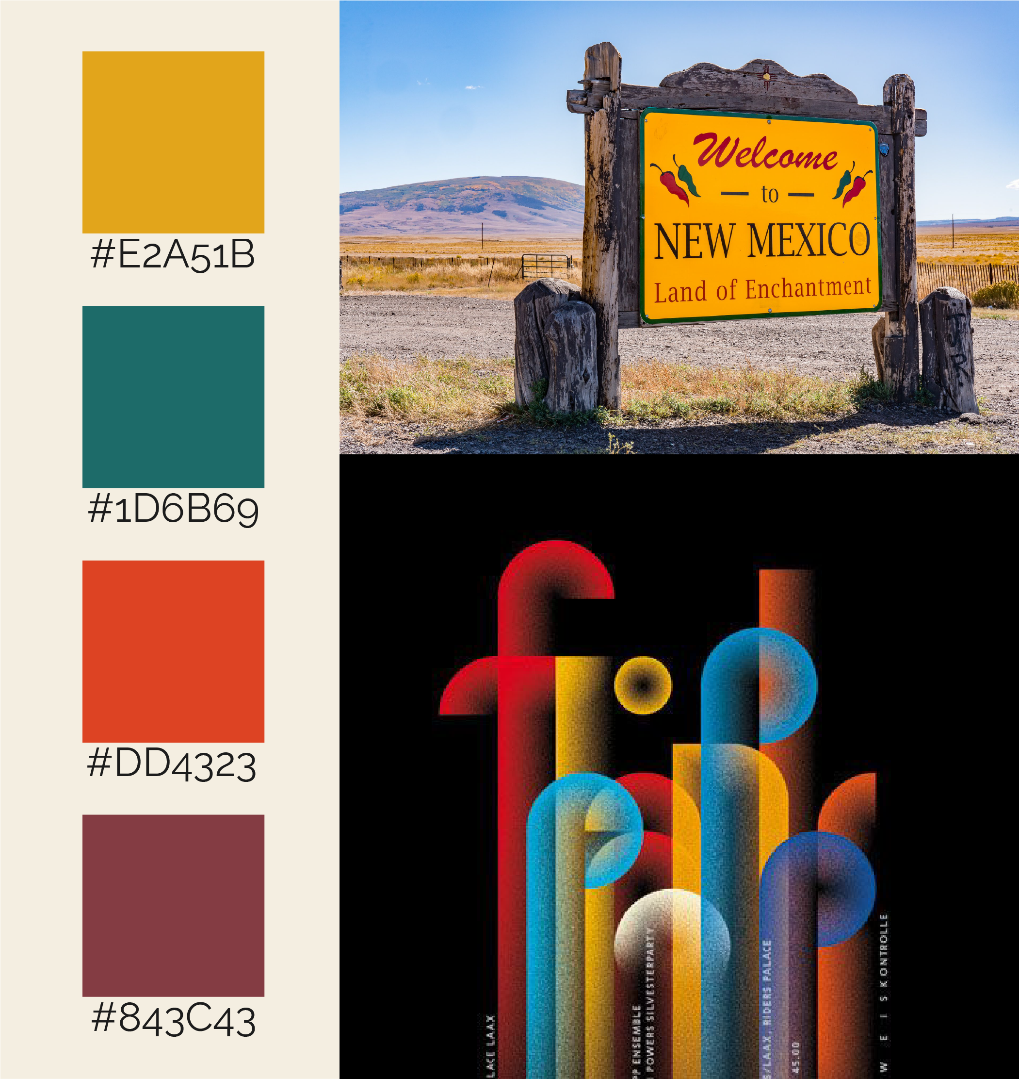
Color Palette
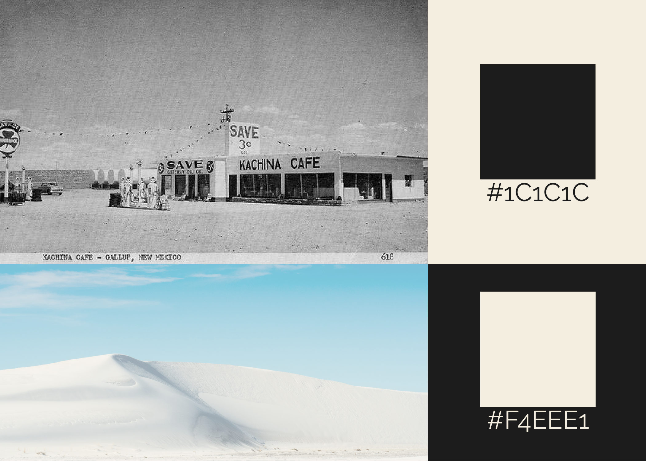
Base colors were established to be used as substitutes for dark and light. Washed black and light tan gives an overall comfortable feel.
Secondary colors express life found in the desert.